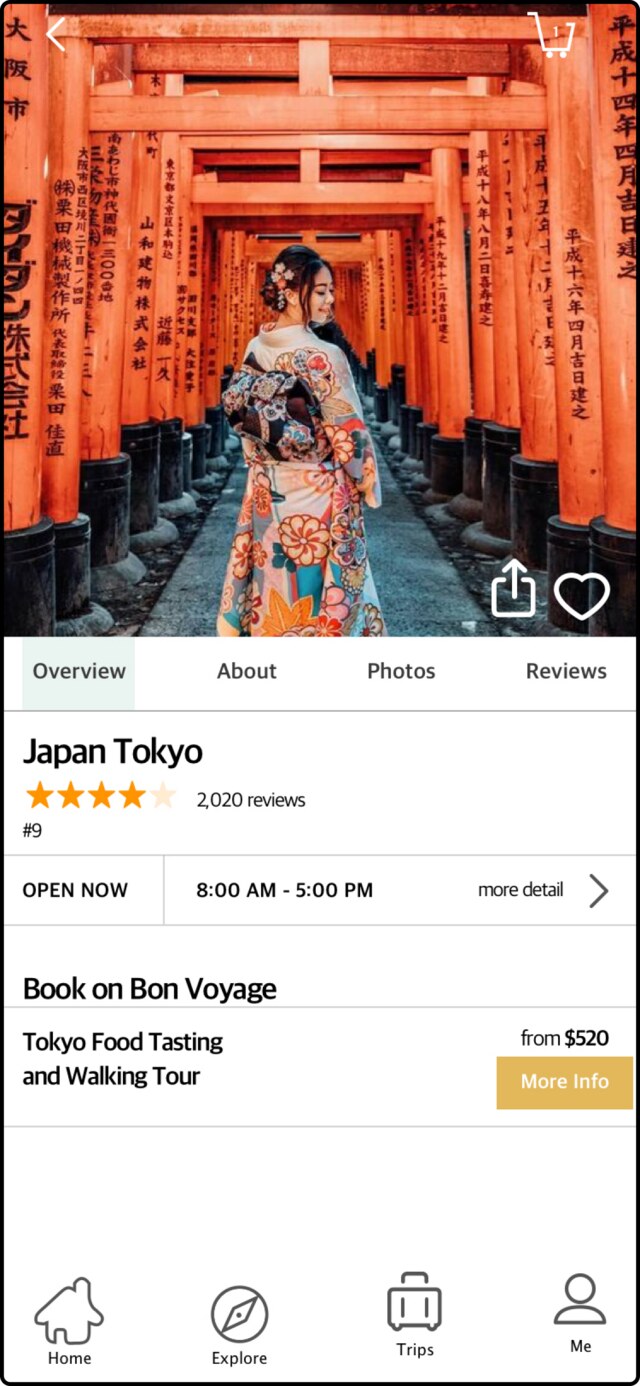
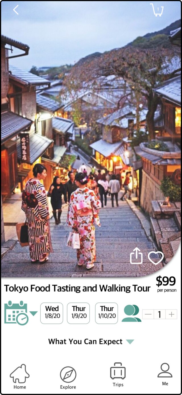
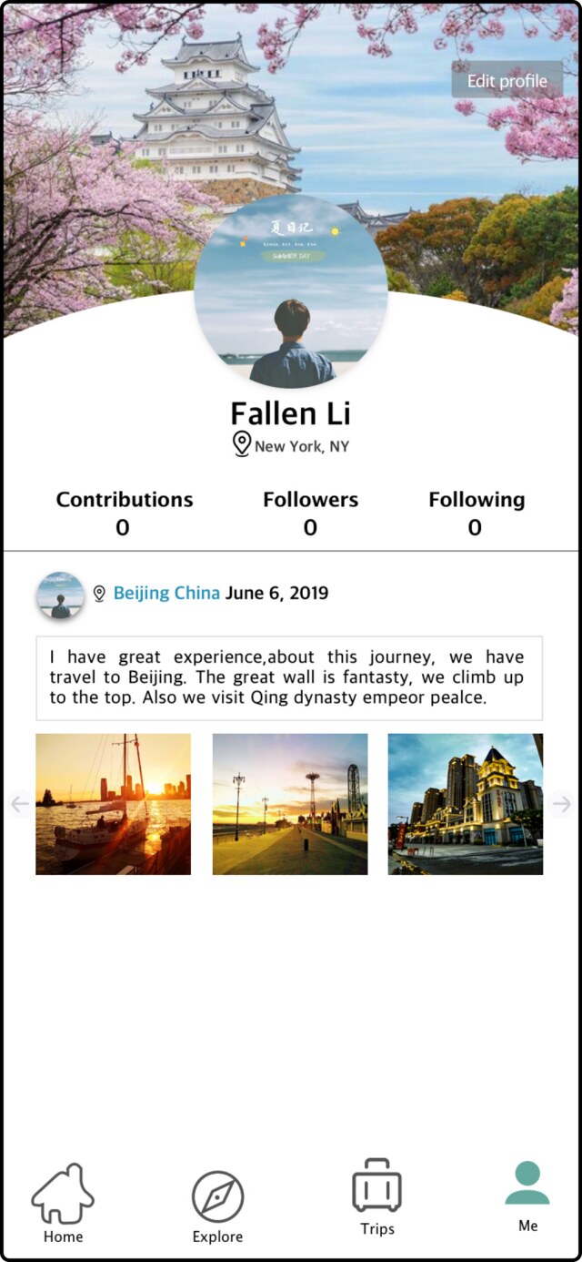
Bon Voyage is a mobile travel tool that provides curated suggestions and local insights for cities around the world. The goal was to design a single platform that covers every stage of trip planning — from itinerary building to on-the-ground exploration.
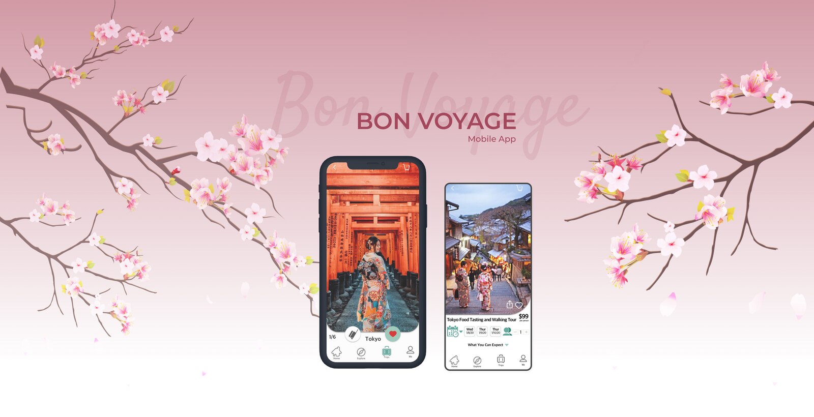
Existing travel apps fail to deliver a truly personalized local experience. Users were left piecing together multiple tools just to plan one trip — costing time and adding friction to something that should feel exciting.
Build a flexible, unified travel planning app that serves every type of traveler — from budget-conscious trekkers to casual tourists — making trip planning smart, simple, and enjoyable.
I conducted user interviews to understand real travel behavior and pain points before defining the solution.
A competitive analysis was conducted to map the landscape and identify gaps in existing travel apps — understanding what competitors do well and where they fall short informed the product direction.
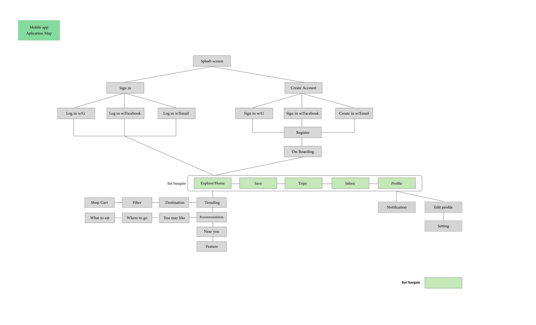
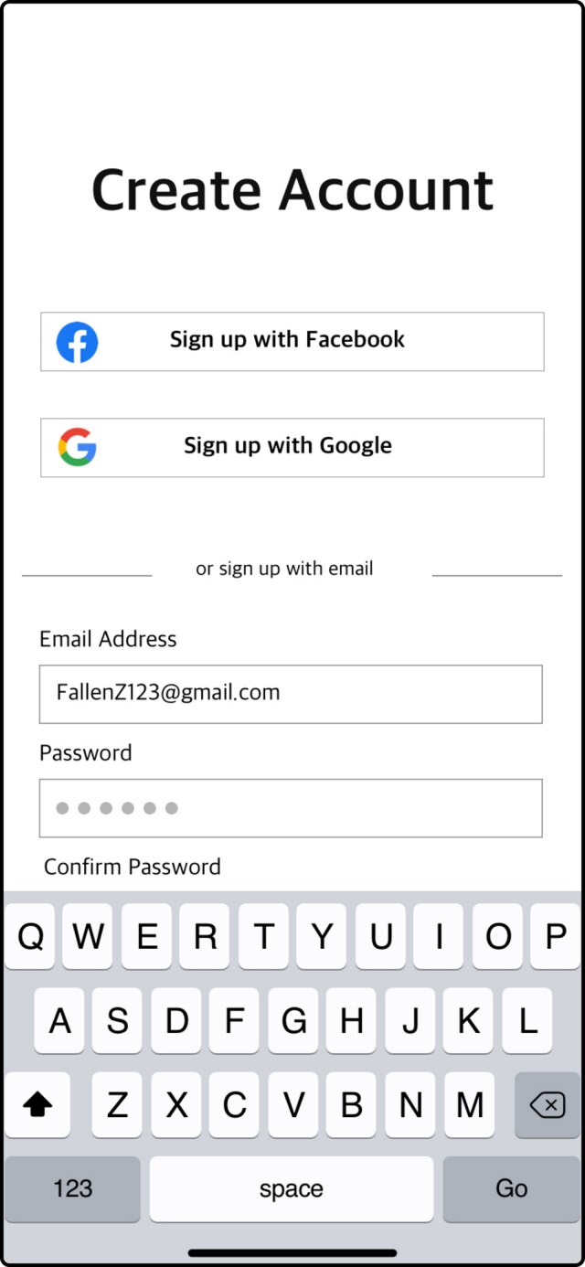
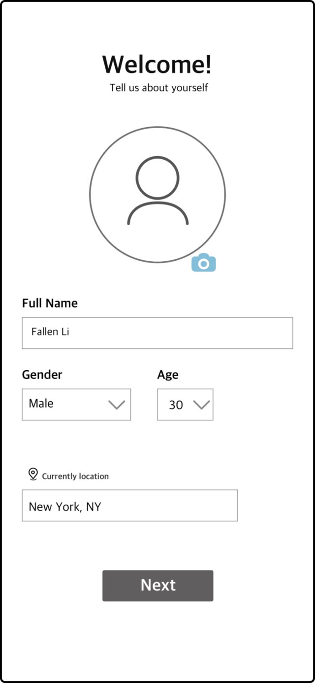
View Competitive Analysis →Before wireframing, I mapped the full application structure — from splash screen through sign-up, onboarding, and every tab in the bottom navigation. This kept the flows consistent and made sure no screen was designed in isolation.
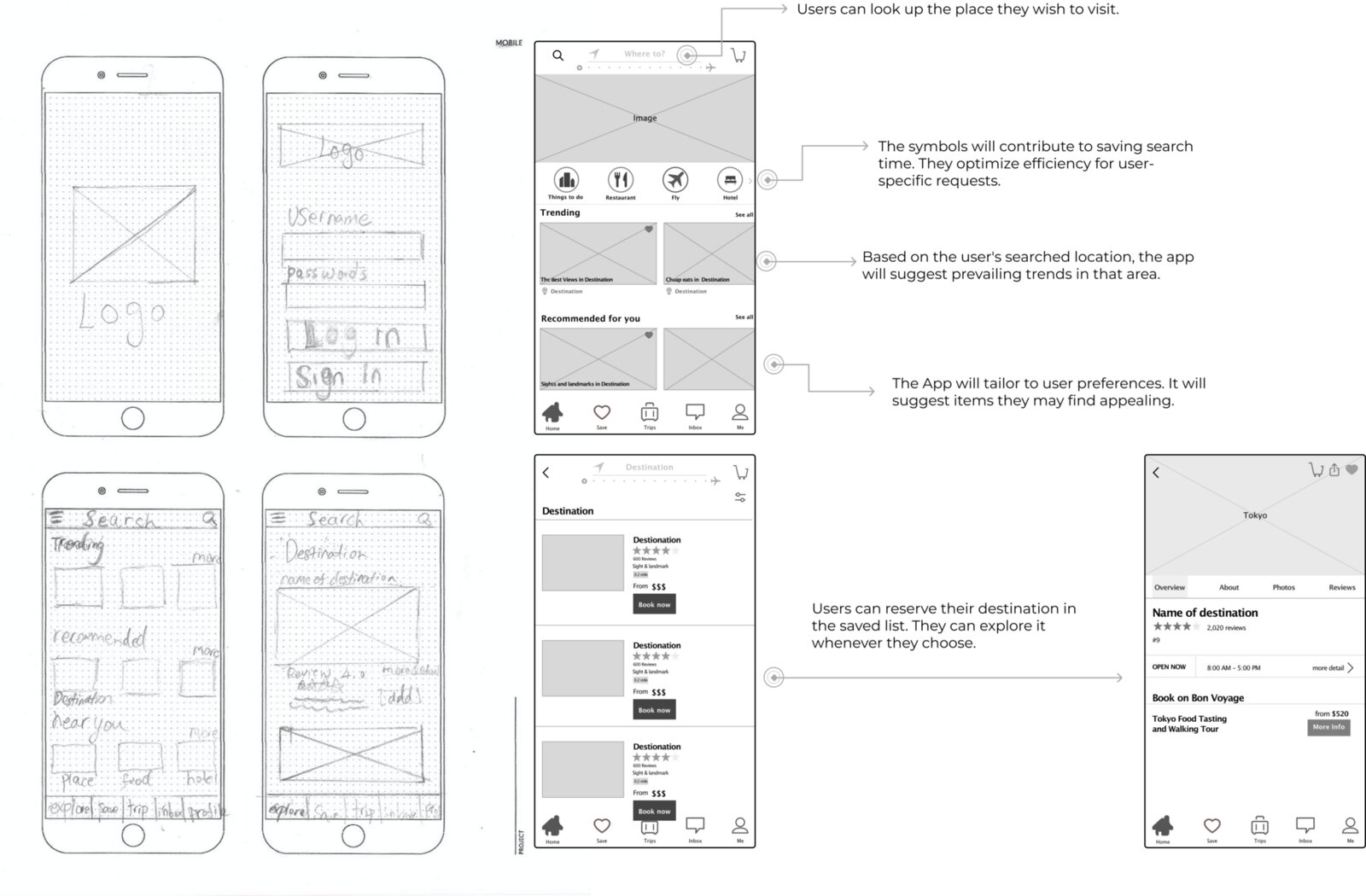
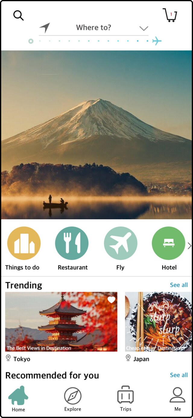
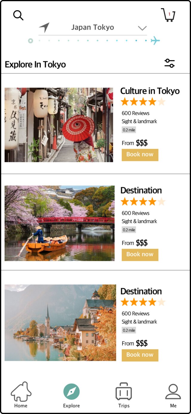
The wireframe priority was clarity and speed. Since users rely heavily on visuals when exploring destinations, I led with photography and kept text minimal — letting imagery do the work while reducing cognitive load.
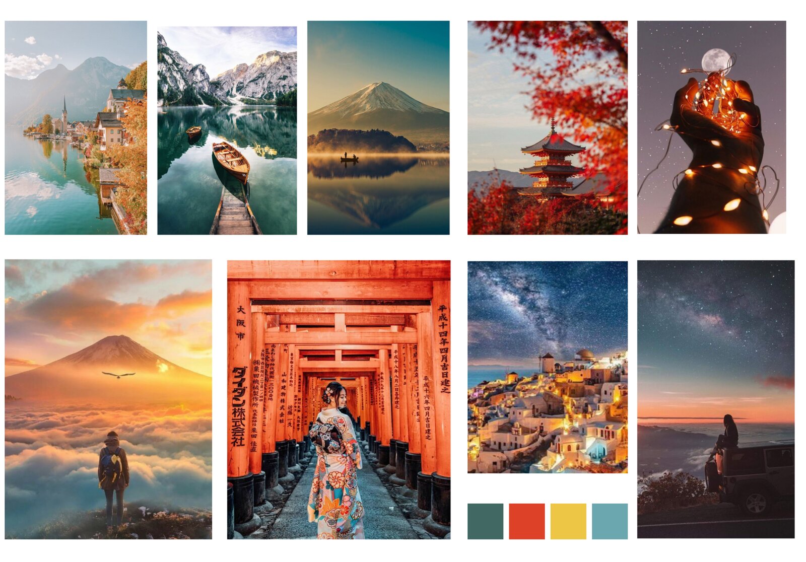
Warm, golden-hour travel photography paired with a focused color palette — teal, coral, mustard and sky blue — set the emotional tone before any UI was drawn, keeping every screen feeling like an invitation to go somewhere new.
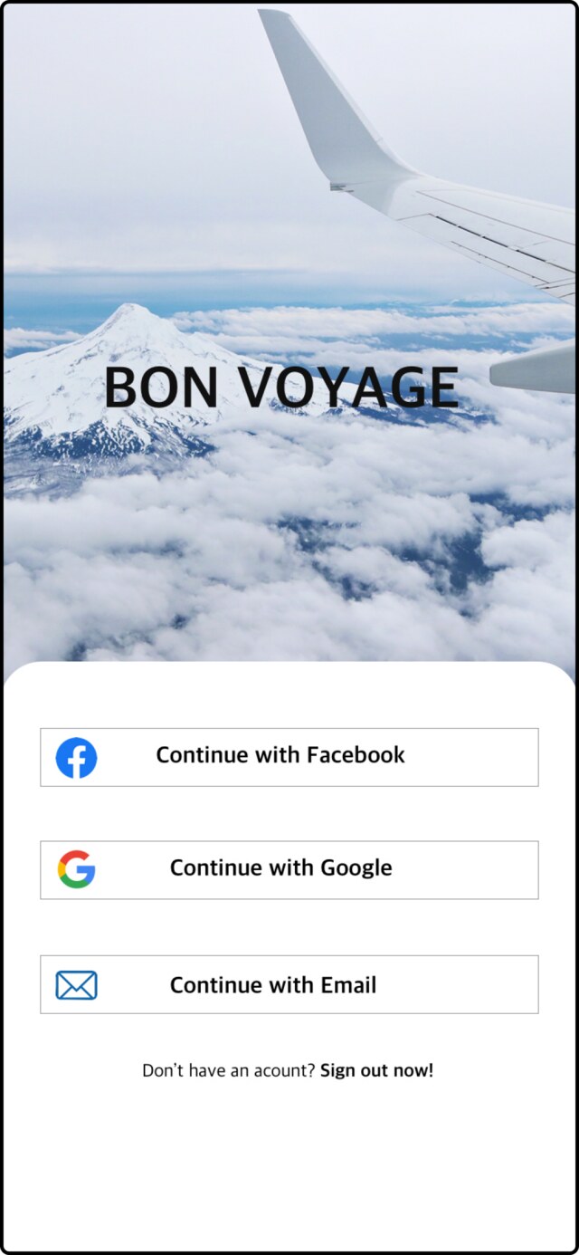
After wireframes were validated, I moved into high-fidelity screens — building simple, purposeful UI elements that kept the experience friendly and intuitive throughout.
An interactive prototype was built to validate the full user flow across all screens. Navigation, micro-interactions, and task completion were tested to ensure the experience held up end to end before final delivery.
The final UI delivers a unified travel experience — destination discovery, local recommendations, and itinerary planning in one cohesive interface. Every screen was designed to feel lightweight and confident, matching the tone of the traveler it's built for.
In the final stage, I built an interactive prototype to validate the user flow. All screens were tested to ensure smooth navigation and functionality.
This project strengthened my ability to design for a diverse user base with varying budgets, travel styles, and expectations. The key lesson: when the subject matter is inherently visual, let the design reflect that — imagery-first layouts outperformed text-heavy alternatives in every round of feedback.
Limited usability testing rounds were the main constraint. Future iterations would benefit from A/B testing on key flows to validate navigation decisions with harder data.
Have a project in mind, or want to see more of the process behind Bon Voyage? Get in touch.