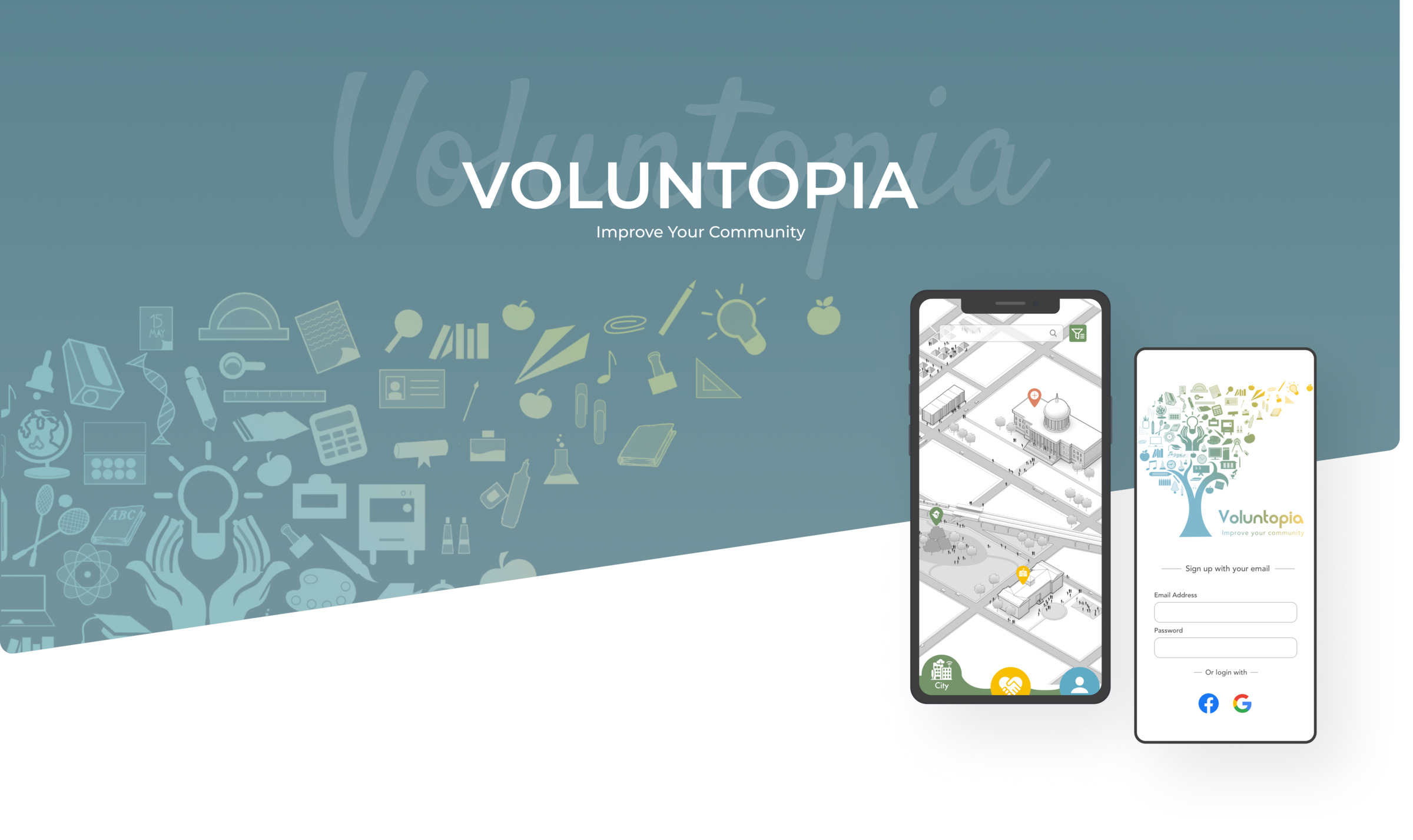
Voluntopia is a mobile app that connects community members with local volunteering opportunities. Designed to make giving back as frictionless as possible — from discovery to sign-up.
People want to volunteer but struggle to find relevant local opportunities that fit their schedule and interests. Existing platforms felt impersonal and difficult to navigate, creating a barrier between intention and action.
Design an engaging, easy-to-use volunteer-matching app that encourages community participation, targeting users aged 18 and older, and making the path from discovery to sign-up as clear as possible.
Usability testing was conducted on high-fidelity prototypes across multiple task types — from browsing to transaction flows.
A persona was provided by the UX team to build a shared understanding of the target audience — their needs and frustrations shaped every decision from here on.
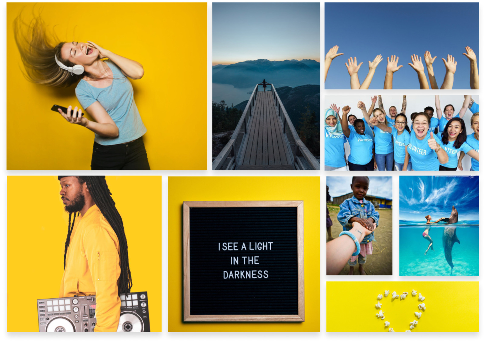
A moodboard defined the visual language — warm, approachable tones paired with a clean layout that keeps the focus on the community and the cause, not the interface. The design system was built around accessibility and clarity, ensuring the app felt welcoming to users across varying levels of tech familiarity.
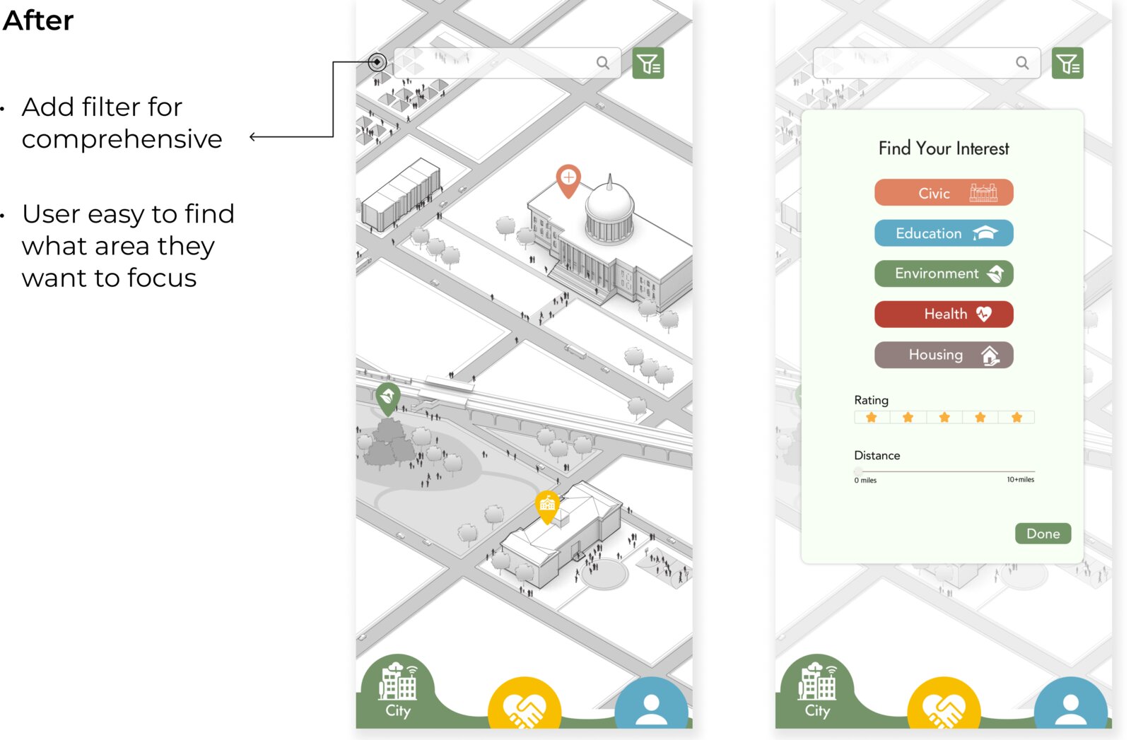
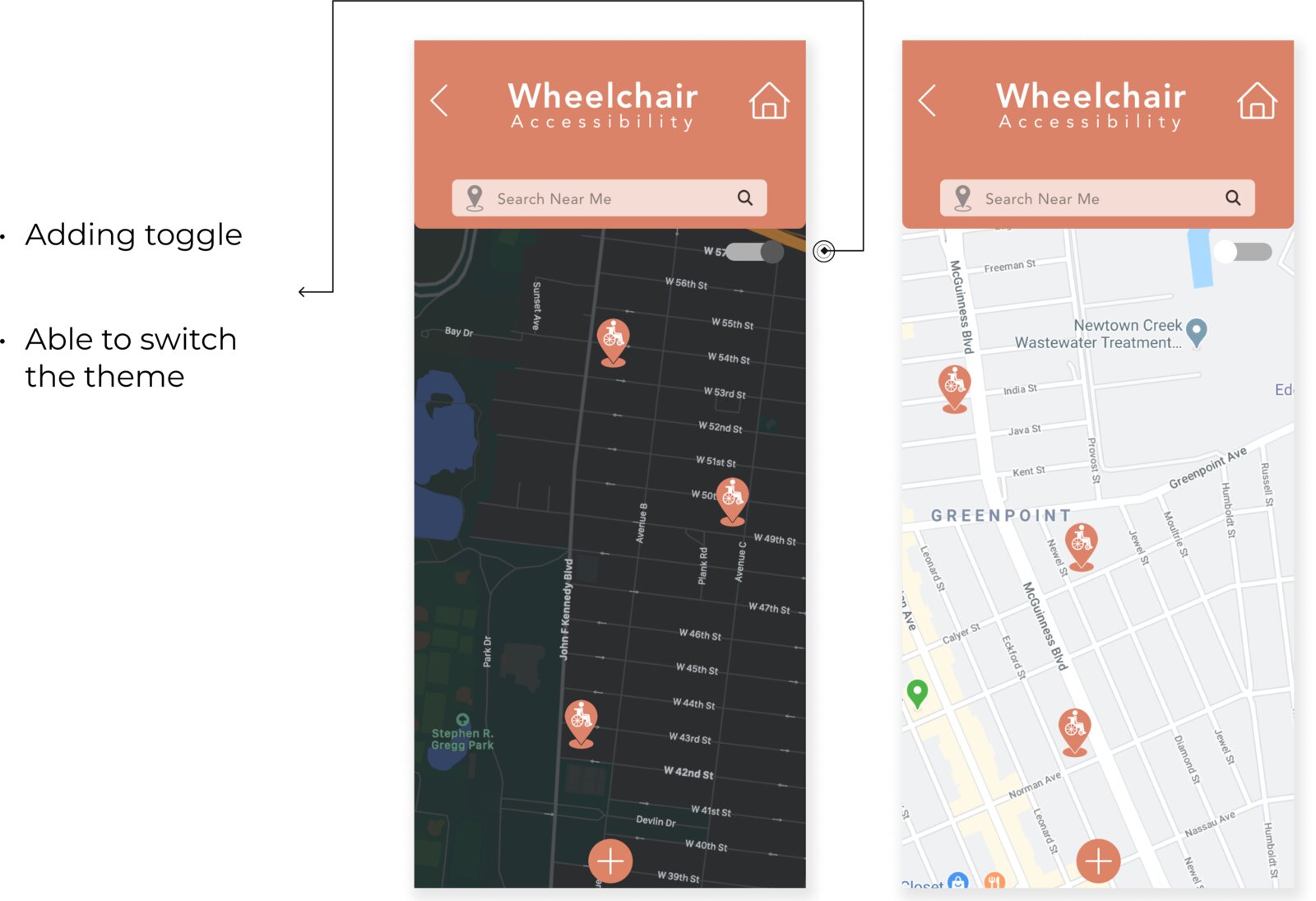
Testing surfaced clear friction points that directly shaped the final design: a filter system for the home page, a list/map toggle for browsing, and a wheelchair-accessibility toggle so users with mobility considerations could filter for accessible locations — including a dark mode pass on the map view.
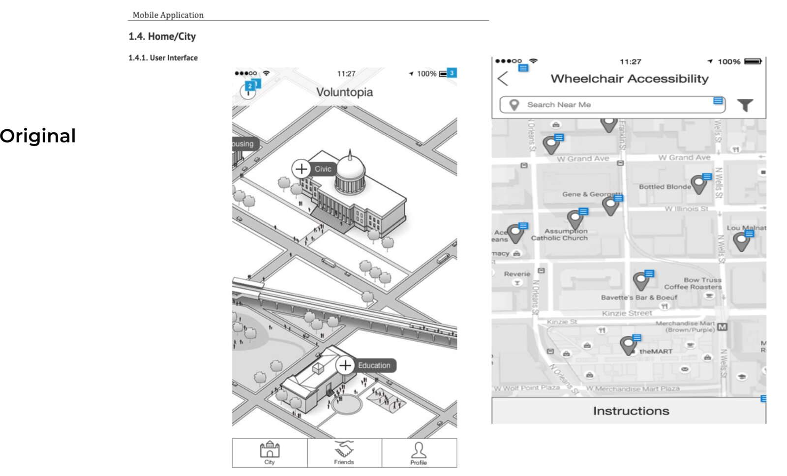
Early low-fidelity exploration of the Home/City map and the Wheelchair Accessibility list view, before any visual system was applied.
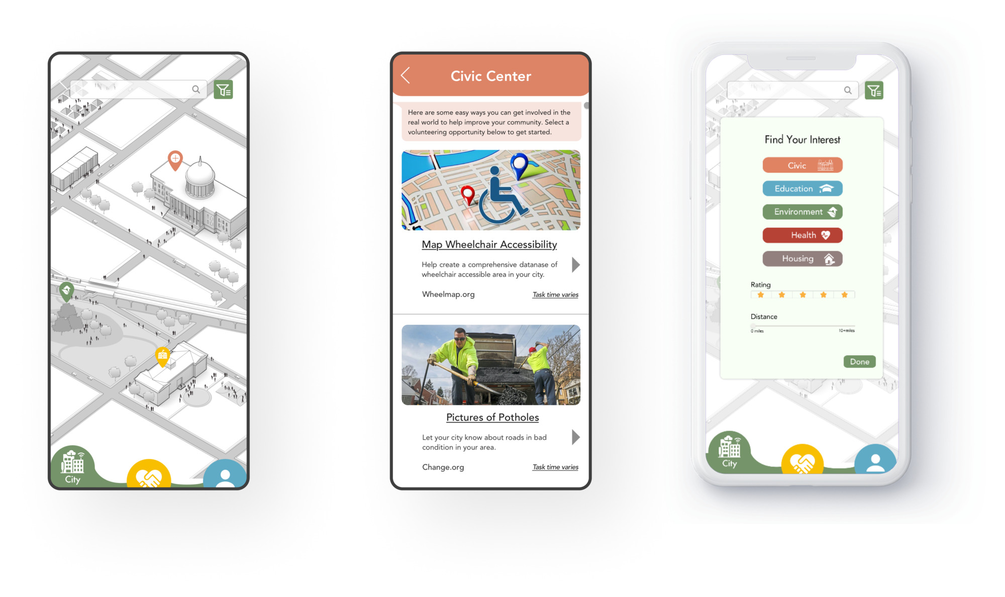
The city map moved to full color with a clearer bottom navigation, and a comprehensive filter panel — "Find Your Interest" — was added so users could narrow results by category, rating and distance.
A theme toggle was added to the Wheelchair Accessibility map, letting users switch between light and dark mode depending on their preference or environment.
The final UI covers the full user journey — from the city map and friend list through to individual profile pages. Each screen was designed to feel community-driven and approachable, with a visual system that scales consistently across all states and flows.
On the City page, users can search for volunteer opportunities or use the filter to find opportunities closest to their region and interests — including the Civic Center detail view and the "Find Your Interest" filter panel.
Tapping a pin opens the Civic Center flow — animated preview.
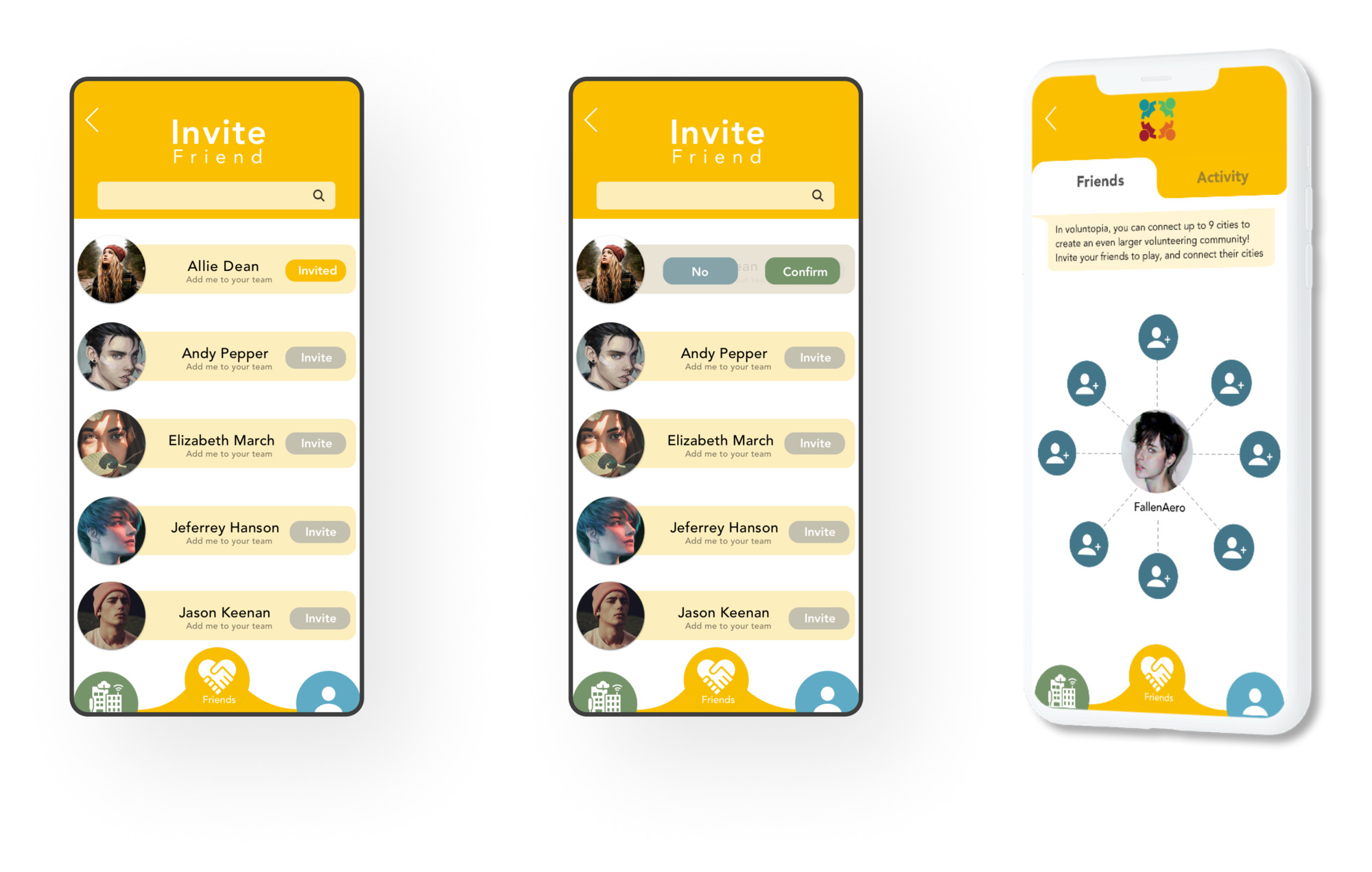
On this screen, users can invite friends to join their group and connect up to nine cities to build an even larger volunteering community together.
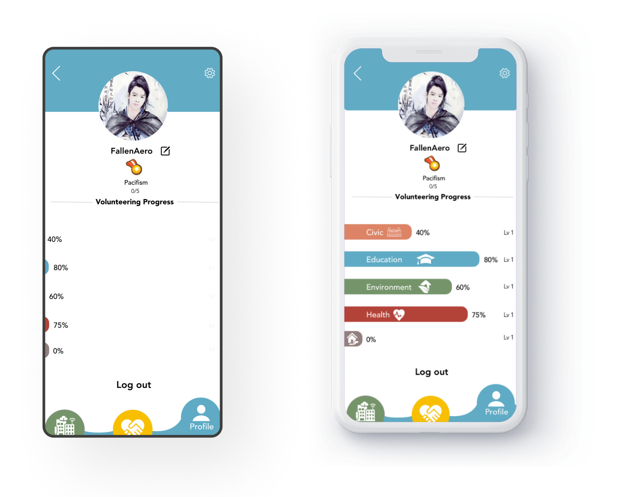
Users can view their volunteering progress on their profile page. Each category — Civic, Education, Environment, Health — tracks completion toward a badge, awarded at 100%.
Designing for an audience with such varied tech familiarity reinforced how much inclusive details matter — a wheelchair-accessibility toggle or a dark mode pass isn't a nice-to-have, it's what makes an app usable for everyone the community is trying to reach.
Usability testing directly shaped the roadmap: every major iteration — filters, the map toggle, the accessibility toggle — traced back to a specific point of confusion or a specific request from real users.
Have a project in mind, or want to see more of the process behind Voluntopia? Get in touch.