UX/UI Case Study

Floracracy — building the visual system for a premium floral platform

Floracracy is a web-based platform that guides users in crafting custom floral arrangements. With their MVP already in beta and actively processing orders, they needed a cohesive UI system to match their premium brand positioning.

Role
UI Designer
Duration
4 Weeks
Tools
Figma, Illustrator, Photoshop
Deliverable
Design System + Prototype
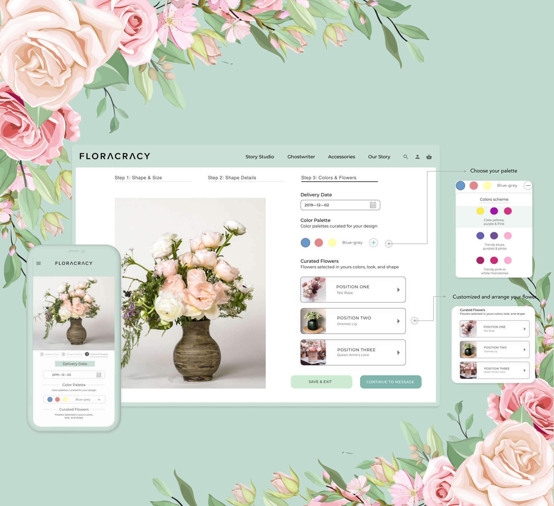
Floracracy website and mobile app showing the flower arrangement builder

A premium brand with no visual language yet

The client had existing UX wireframes but no visual design layer. The interface didn't reflect the brand's premium identity or support users through emotionally driven purchase decisions.

Three principles, one visual language

Three design principles guided every decision — designing for real user needs, aligning with luxury brand standards, and making sure what users see matches what they receive.

Empathy icon

Empathy

We are ready to listen in order to truly understand and uncover the latent needs and emotions of the customers we are designing for.

Exclusivity icon

Exclusivity

We adhere to providing our users with the highest quality experience by ensuring our designs align with contemporary luxury products and brands.

Honesty icon

Honesty

We are dedicated to ensuring customers receive the same quality products they have seen on the website.

View Wireframes (PDF) →
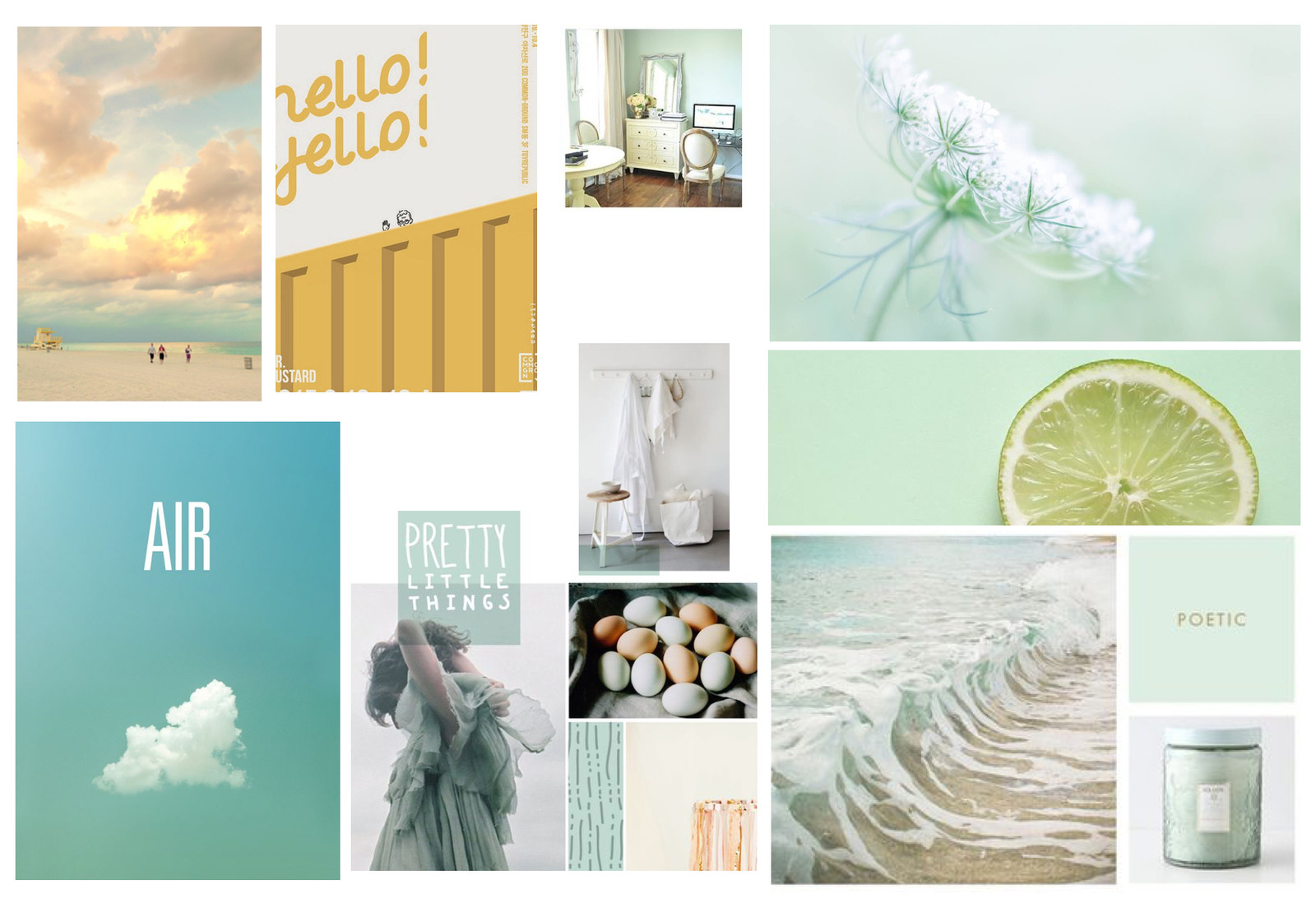
Moodboard

A palette of bright, warm colors to feel pleasant and refreshing. Turquoise gives off a feeling of calm and comfort at first sight.

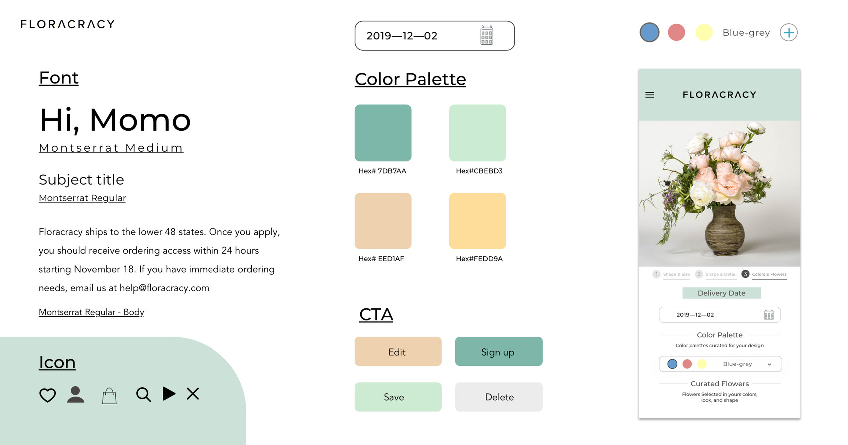
Style Tile

A minimal layout that emphasizes content in a clear, concise hierarchy.

Listening before designing

I conducted user interviews and usability testing to identify friction points before any visual work began.

  • 90% of users wanted to edit their arrangement after creation — a gap in the existing flow.
  • Users were consistently confused by the message/journal page and how it translated to the physical product.
  • Users responded positively to visual consistency — confirming a unified design system was the right priority.
Key Insight

Users liked the consistency in design throughout the entire website design.

Keynote from an interviewer

"I want it to be more balanced on how the content itself is robust and the design is simple and clean."

Key Finding

Users wanted more clarity on the message page — they were confused about how the journal message actually works in the physical product.

Two targeted fixes, no structural rework

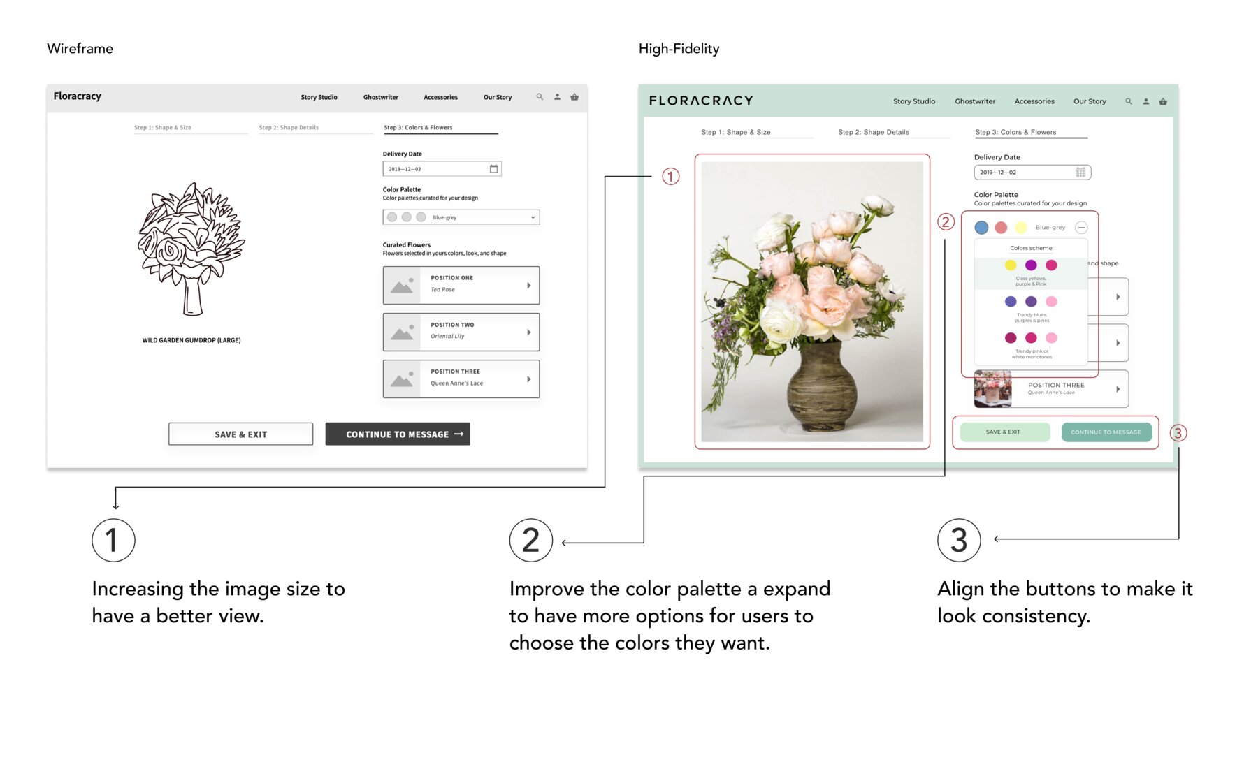
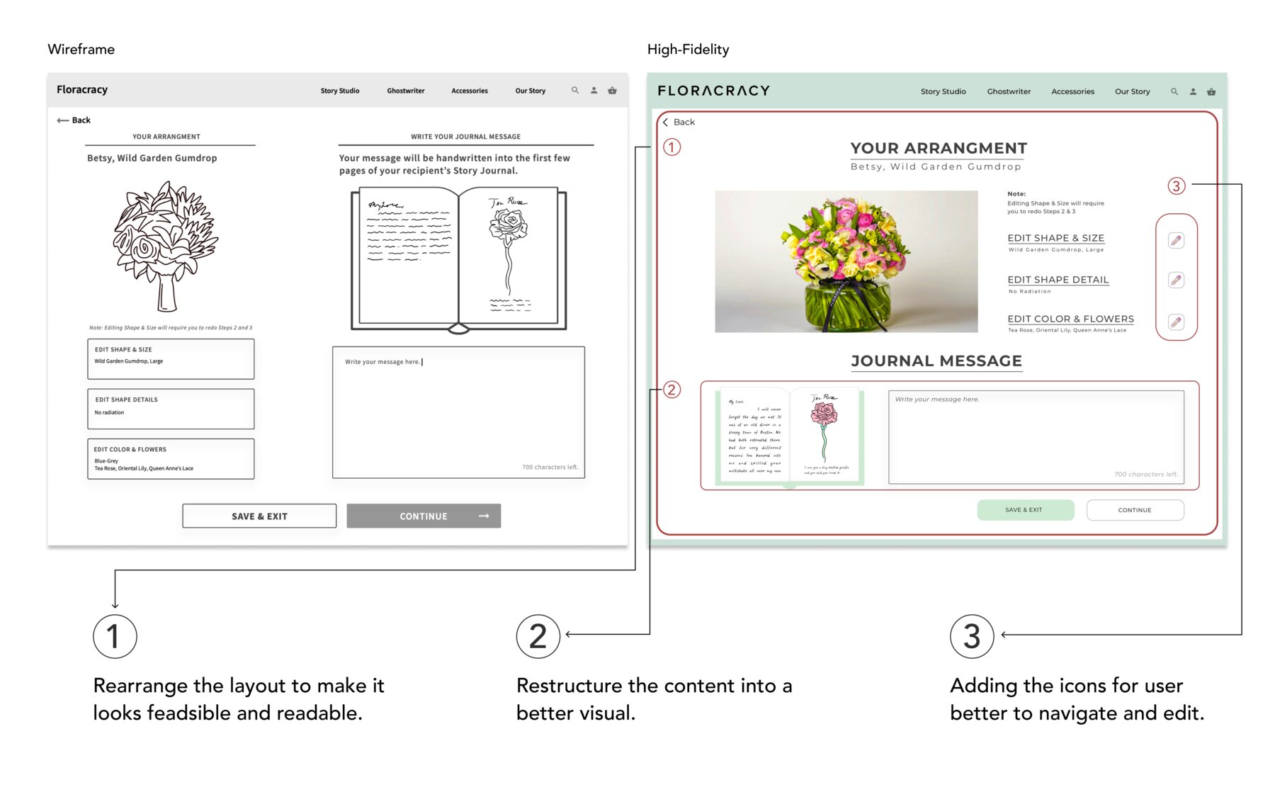
Testing surfaced two clear issues. I proposed targeted modifications without disrupting the existing wireframe structure.

Arrangement edit flow

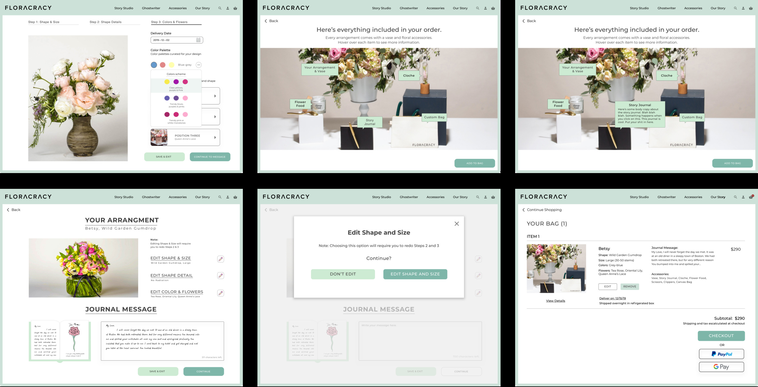
Added a clear revision pathway so users could modify their design after creation.

Message / journal page

Redesigned with clearer copy and visual cues to explain how the handwritten message translates to the physical product.

From homepage through checkout

The final UI covers the full platform from homepage through checkout. A design system was delivered alongside the screens — documenting components and interaction patterns as a handoff resource for the development team.

What I learned

Working within an existing UX framework sharpened my ability to identify what truly needed to change versus what needed to be respected. The constraint made the decisions more intentional, and the collaboration between UI and development smoother through a structured design system.

DSM — Design System Management

A bridge to connect with the developer, even across other field teams.

View the Design System →

If you want to talk more about the project, I'd like to hear from you :)

Have a project in mind, or want to see more of the process behind Floracracy? Get in touch.

More Case Studies
Bon Voyage → Voluntopia → First Cover →