UX/UI Design Case Study
Ragamuffin, a website revamp for a homegrown children’s boutique
A redesign that turns a dated, classifieds style shop website into a playful browsing experience for kids and their parents.
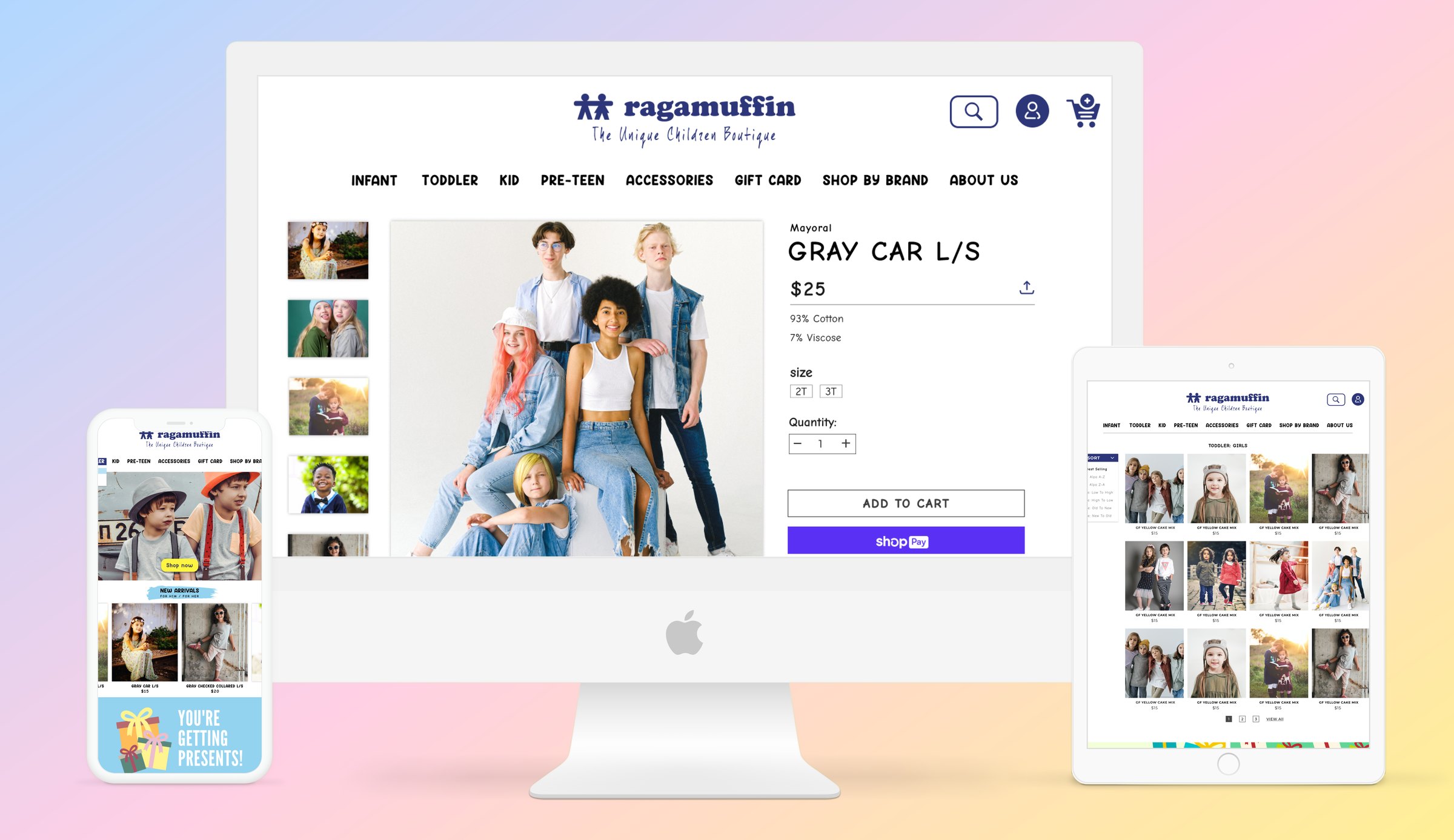
A redesign that turns a dated, classifieds style shop website into a playful browsing experience for kids and their parents.
Ragamuffin is a homegrown store that offers unique clothing and gift items for infants to girls size 16 and boys size 10, as well as a fun selection of great accessories, toys, books, and gifts.
The existing website felt dated, closer to Craigslist than to a boutique made for children. The client wanted a playful, kid friendly style and a better overall experience, so shoppers would enjoy browsing instead of just searching for items.
The pages gave shoppers very little to read or discover. There was no story behind the store, no gift ideas, and no reason to explore further.
Plain layouts and default styling felt more like a classifieds board than a children’s shop. The client wanted a playful, colorful style to match the clothes being sold.
Nothing set the store apart from any other online shop, so shoppers had little reason to come back.
The goal was to captivate users and give them a seamless browsing experience, with a few clear objectives.
Design the interface to look delightful, enjoyable, and simple, so the site feels like a fun place to explore instead of a list to scroll.
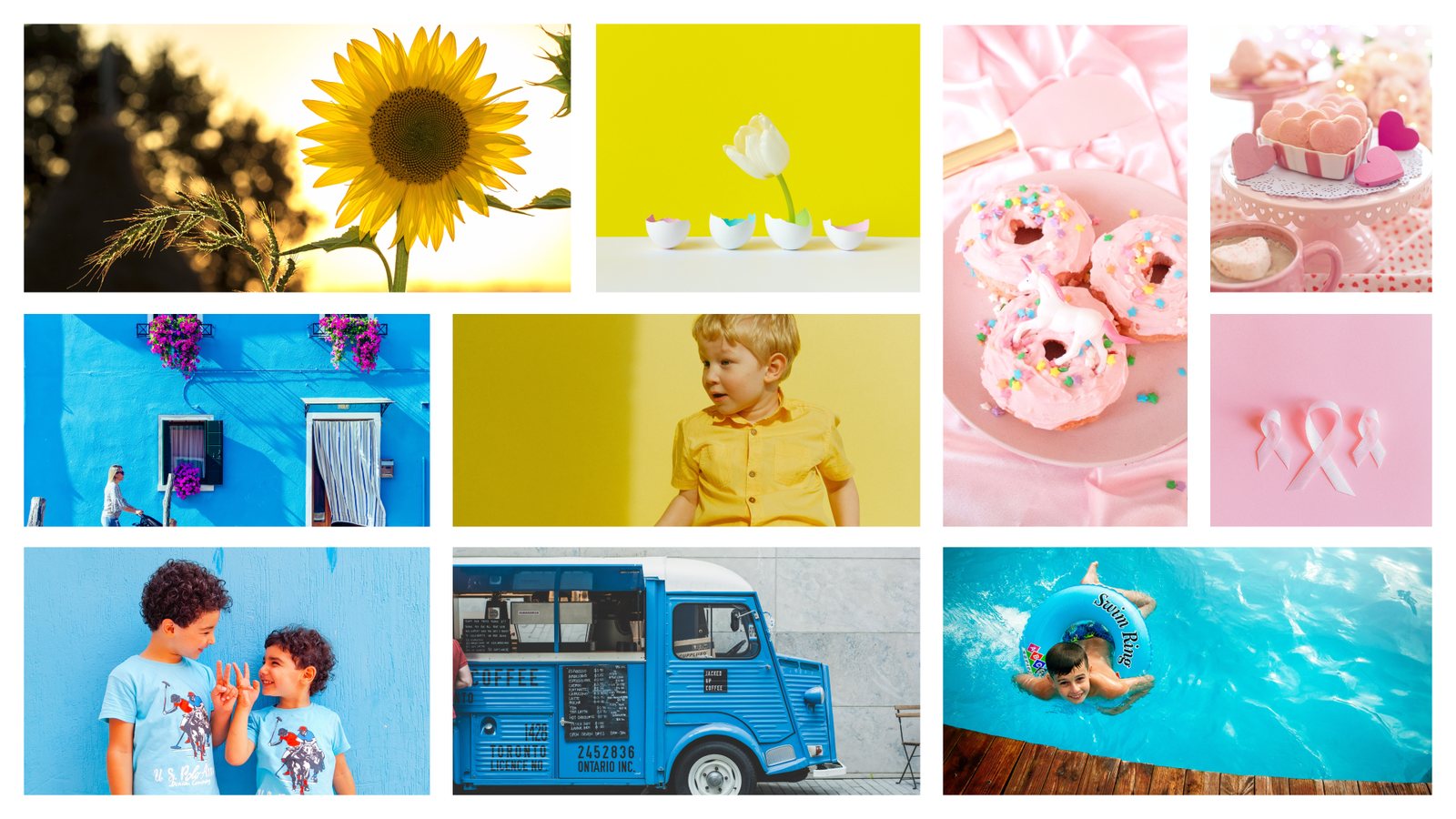
Bright blues, sunny yellows, and soft pinks set the playful mood, with photos of kids, sweets, and sunshine.
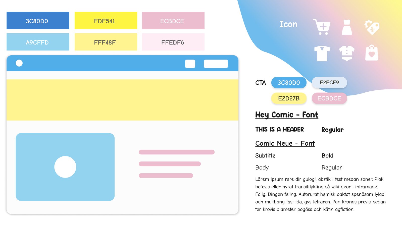
The palette pairs a bold blue with sunny yellow and soft pink. Hey Comic gives headings their personality, while Comic Neue keeps body text easy to read.
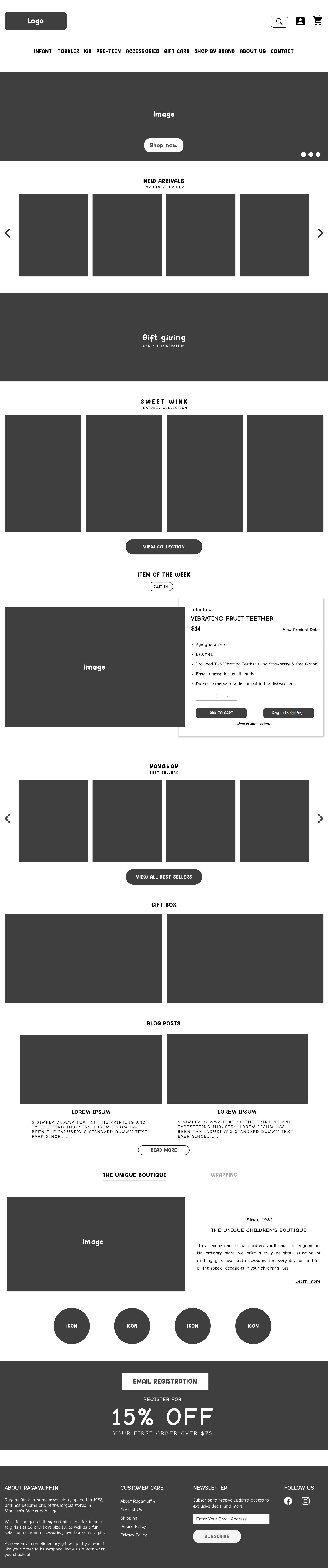
A grayscale wireframe lays out the homepage structure, from the hero and new arrivals to gift ideas, blog posts, and the store story.
The final design replaces the dated look with a playful, colorful system that carries through the homepage, category page, item page, and blog, so every screen feels like the same friendly shop.
New arrivals, you may also like and recently viewed rows, and a blog roundup that tells the story of the store.
Large photography, a bold hero banner, and bright promo banners that make every page feel full of life.
Playful type, brand colors, and friendly icons for unique gifts, kid safe materials, gift wrapping, and fast shipping.
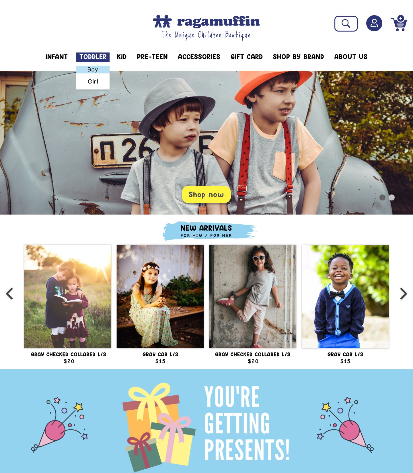
A bold hero image, new arrivals, and a gift banner greet shoppers right away.
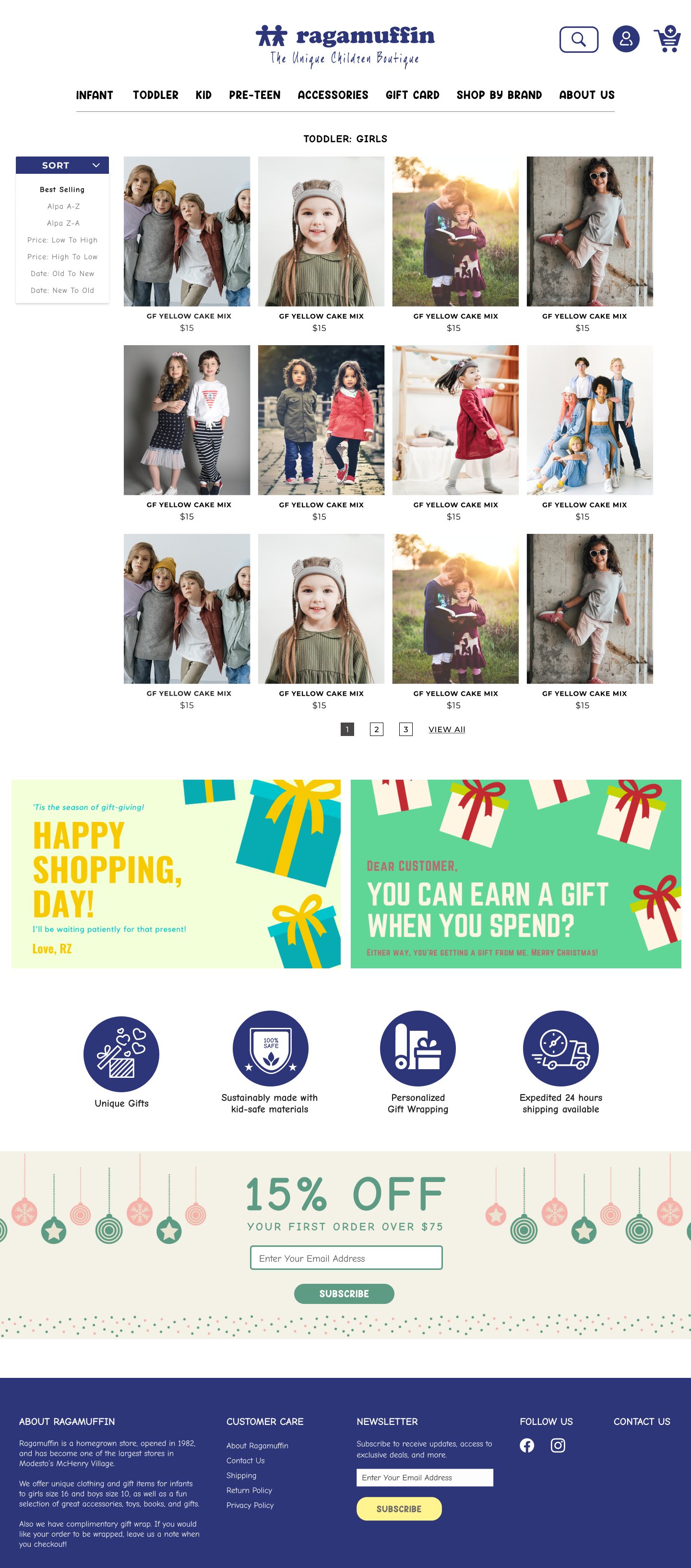
A sort menu and a clean product grid make browsing quick.
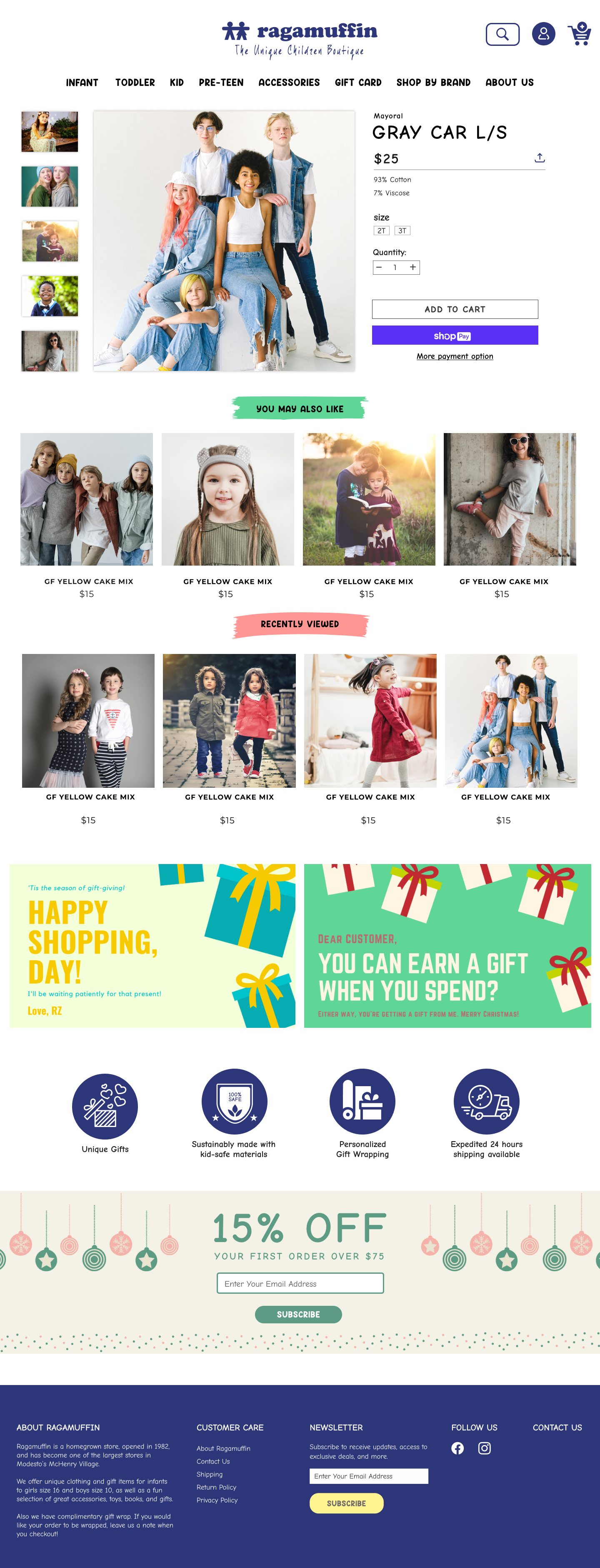
Large photos with size, quantity, and add to cart in one view.
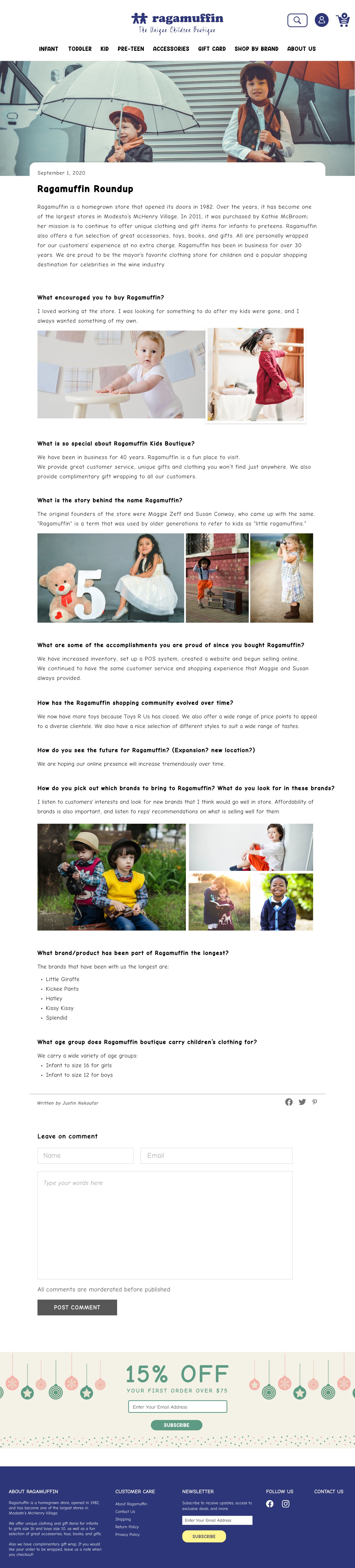
The Ragamuffin Roundup tells the store’s story with photo pairs.
Revamping an outdated site showed me that visual personality matters as much as clean navigation. For a children’s boutique, color, type, and photography do the work of welcoming both kids and the parents who shop for them.