Brand / Website Case Study

First Cover: a unified brand and website for a fintech insurance platform

First Cover is a fintech insurance platform. I led the redesign of their marketing website to fix unclear navigation and fragmented branding, delivering a responsive site with a unified visual identity.

Role
UX/UI Designer
Duration
3 Months
Tools
Figma, Illustrator, Anima
Deliverable
Responsive Website
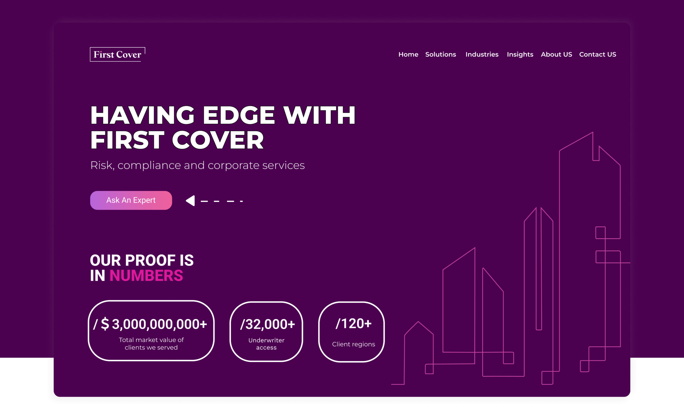
First Cover website homepage showing the hero section and proof-in-numbers stats

Confusing navigation, fragmented brand

Problem

The original site suffered from a confusing navigation structure and inconsistent visuals: typography, color, and logo usage varied across pages, weakening both usability and brand recognition.

Goal

Rebuild the site experience around clear navigation and a cohesive brand system, so users could find what they need quickly and the brand would read as one consistent voice across every touchpoint.

Grounding the redesign in real pain points

I ran stakeholder interviews and user research first, then backed it up with a competitive analysis of 5 competitor sites, so every decision traced back to an actual problem instead of a hunch.

  • Users struggled to find key product and service information, confirming navigation as the top priority.
  • Stakeholders flagged inconsistent branding as a barrier to building trust in a financial product.
  • Competitive analysis showed competitors presenting their services with clearer structure and stronger visual consistency, a gap First Cover could close.

Structure first, then a visual system to match

I restructured the information architecture first, then built responsive wireframes and high-fidelity prototypes in Figma to validate the new navigation before visual design began. In parallel, I developed unified brand guidelines: typography, color palette, and logo assets.

Visual Exploration

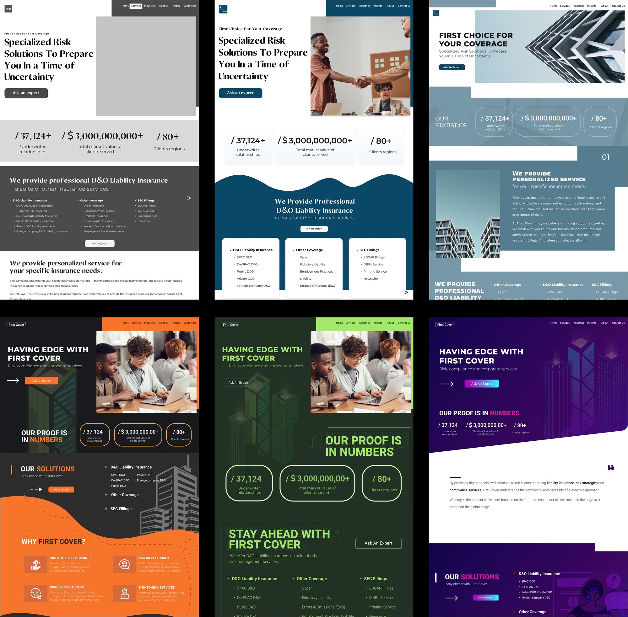
Early homepage direction explorations across color and layout before landing on the final purple identity.

Navigation Redesign

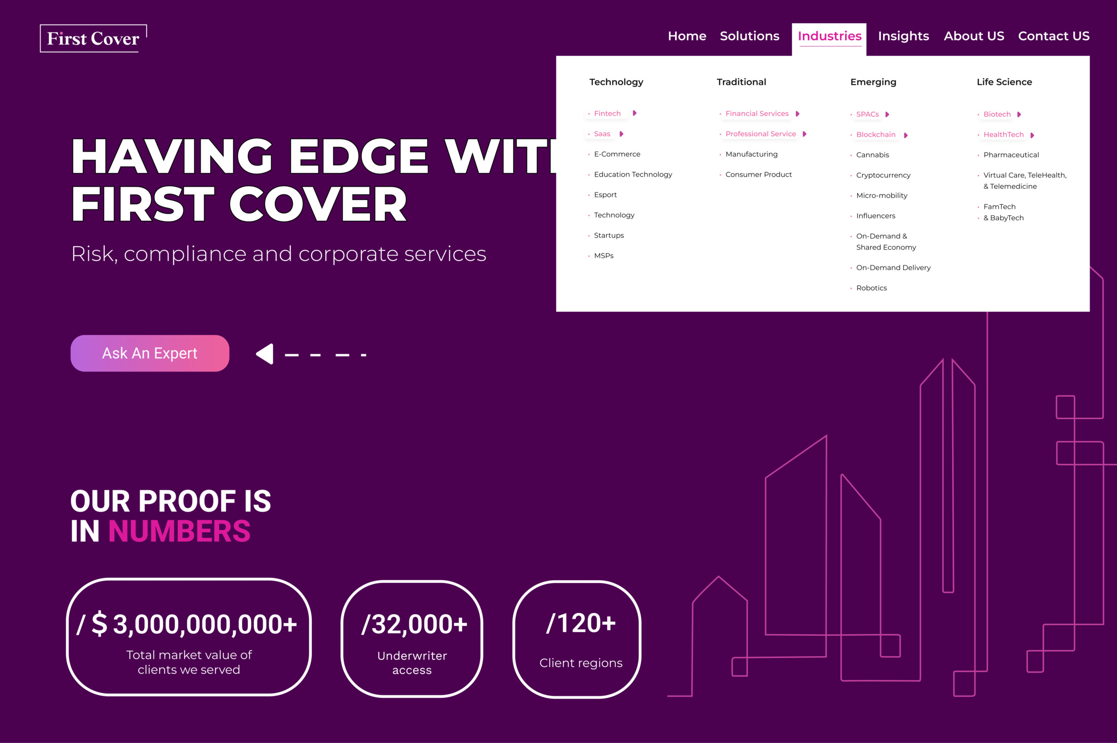
The Industries mega-menu, restructured into clear Technology, Traditional, Emerging and Life Science groupings.

Brand Guidelines

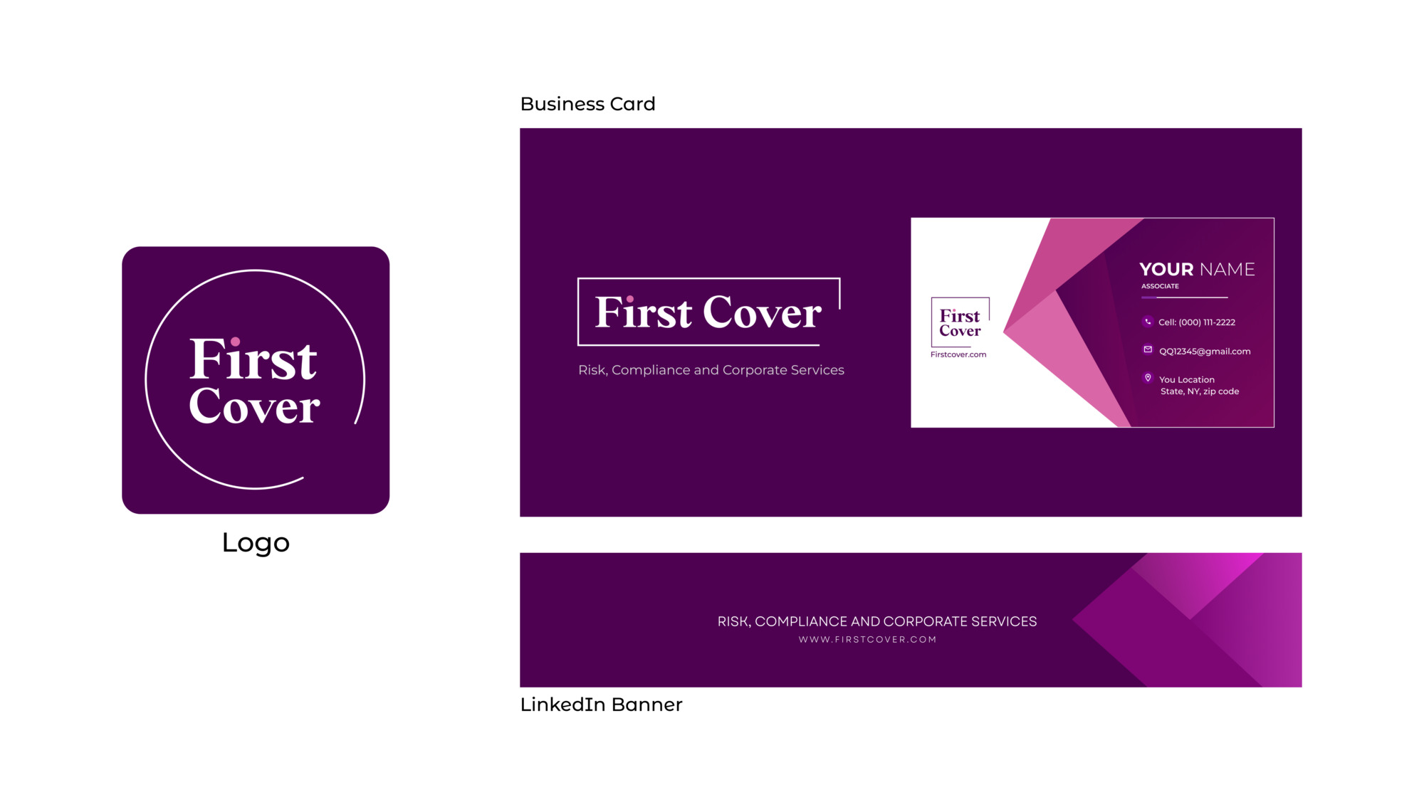
Unified logo, business card and LinkedIn banner, one consistent voice across every touchpoint.
A signature moment, without distracting from the content

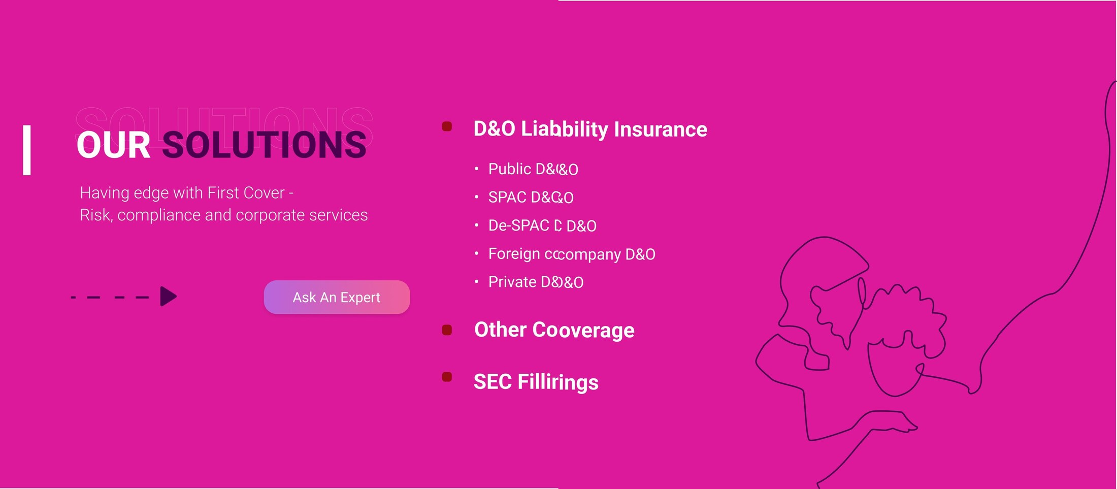
The client wanted a signature interaction for the homepage. I designed a line-shape illustration that draws itself in as you scroll through the Solutions section, giving the page some personality while staying out of the way of the actual content.

The line illustration before and after it draws in on scroll.

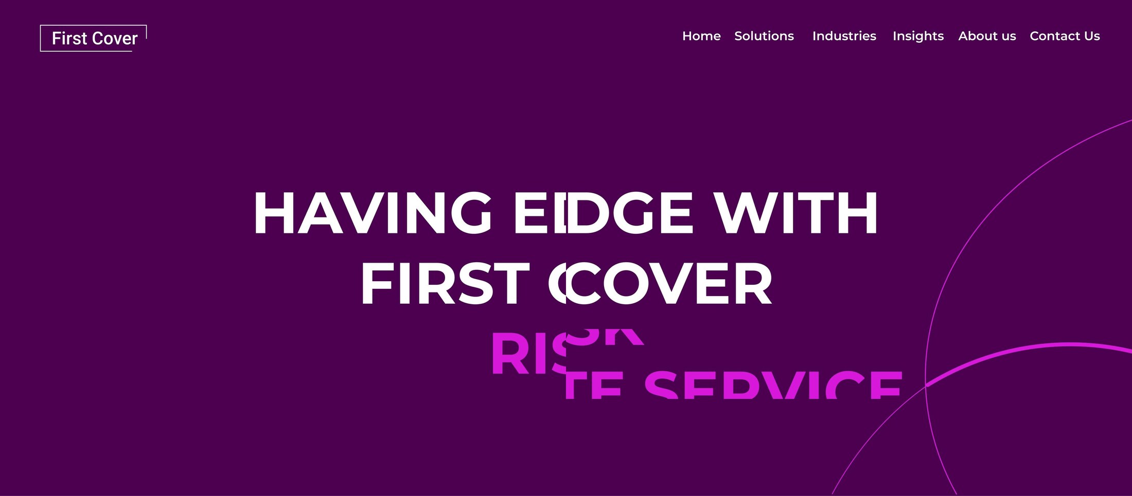
Hero Text Reveal

The hero subtitle reveals progressively as the page loads and scrolls.

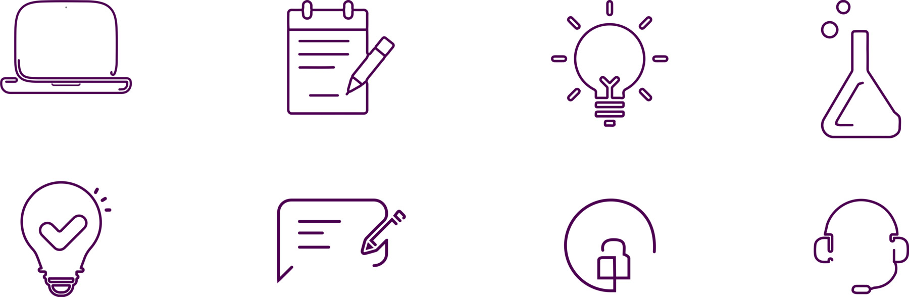
One icon system, aligned with the new brand

The existing icon set was inconsistent in style and weight, so I restructured and simplified it into one system that actually matches everything else in the new brand.

Production-ready, and built to stay on-system

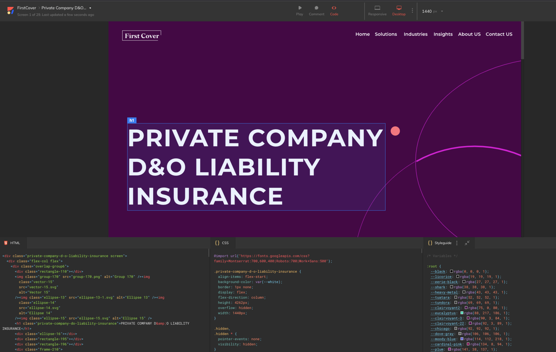
Designs were converted to production-ready HTML via Anima, giving developers a working reference and cutting implementation time. Brand guidelines were delivered as a shared resource so future pages stay on-system.

Clearer navigation, measurable engagement

+20%
User engagement improved after the new site launched.
1
Consistent brand voice across every touchpoint, replacing fragmented visuals.

The client praised the clarity of the new navigation and the consistency of the visual identity.

What I learned

Redesigning for a fintech brand showed how directly trust ties back to consistency: when type, color, and navigation vary from page to page, users start to question whether the product itself can be trusted.

Given another iteration, I would validate the new navigation with task-based usability testing before launch rather than relying on post-launch metrics alone.

Explore More
Photography 3D & Motion Graphic / Visual Design Floracracy Bon Voyage Voluntopia PetPal